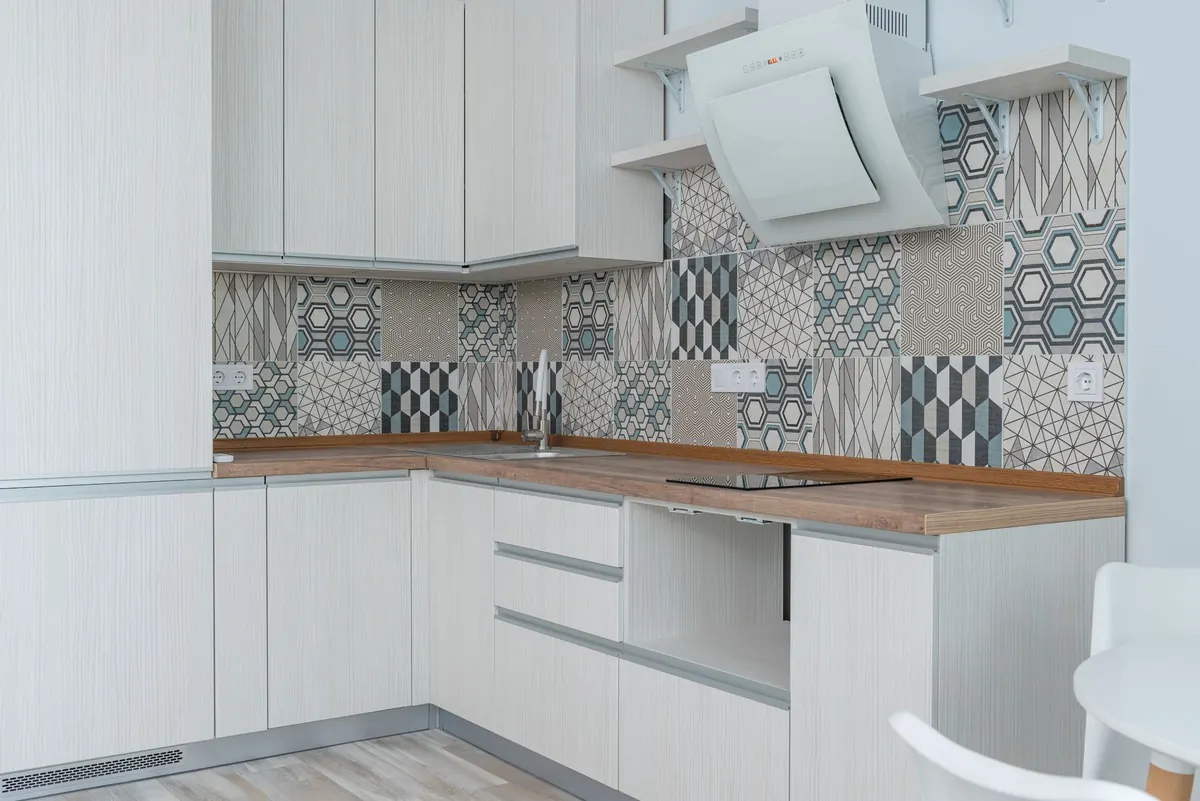
How to Choose the Right White Paint for North-Facing Rooms
Every north-facing room has the same complaint, and it is rarely the paint's fault. North light arrives without direct sun, so it is cooler, softer and more changeable than light from any other direction. A white that looked creamy and inviting under shop lighting can read chalky grey by four o'clock. Choose well, though, and that cool, even light becomes an asset: it flatters the right whites and gives a room a calm, gallery-like quality that sunnier rooms struggle to match.
Start with the room, not the colour card
Before you look at a single swatch, work out what your light is actually doing. Stand in the room at nine in the morning, at one in the afternoon and again at seven, and pay attention to how the walls change. Most north-facing rooms are at their coolest and flattest in the morning, then pick up a little warmth in the afternoon as light bounces in from outside.
Then look at the fixed things that bounce light around. A pale oak floor throws warmth back onto the walls. Dark carpet, slate or a black hearth swallows it. Green foliage outside a north window — very common in British gardens — pushes a faint green cast into the room in summer. A red brick wall or terracotta pots outside do the opposite and warm the space up. None of this is imaginary; it is light reflecting off surfaces and landing on your walls.
Size and glazing matter too. A north-facing box room with one small window behaves nothing like a north-facing kitchen with glass on two sides. It is also worth checking which way the window really faces. A window that is actually north-east gets bright, cool early light; a north-west one catches a warmer glow on summer evenings.
Undertones, in plain terms
No white paint is neutral in the strict sense. Manufacturers add small amounts of pigment to soften the harshness of raw white, and those pigments give the paint its undertone. Reading that undertone is the whole skill.
- Warm whites carry hints of yellow, cream or pink. Think linen, bone, almond, candlelight. In a north-facing room they gently counteract the blue cast in the light, which is why they are the safe, forgiving choice.
- Cool whites carry hints of blue, grey, green or black. Think chalk, frost, marble. They look crisp and architectural, but in a north-facing room they amplify what is already there — a cool white on a north wall can tip distinctly grey, blue or even lilac once the room is furnished.
- In-between whites sit somewhere in the middle: greige, off-white, soft grey-beige. These are the trickiest, because they can lean either way depending on the light, the floor and what is standing next to them.
Strength matters as much as direction. A white with a trace of yellow is a different animal from one with a good deal of it, and a colour card cannot show you the difference in your own light. That is what sample pots are for.
Two things that catch people out
First, undertones are relative. A white looks warm beside a cooler white and cool beside a warmer one, so judging a single swatch in isolation is close to guesswork. Second, the same tin behaves differently on walls and ceilings: the ceiling receives less light, so it will generally look a shade darker and greyer than the walls beneath it, even though you used the same paint.
A white with a blue undertone will not become warmer through willpower, or through a second coat.
How the light shifts through the day
North-facing rooms are not static. Morning light is the coolest and least forgiving; by mid-afternoon in summer there is more bounce and more warmth in the room. In high summer, north windows do catch early morning and late evening sun as it swings round, which surprises people who assumed the room never sees any. In midwinter, by contrast, you may get weeks of flat, low-level light and very little shadow.
Then there is artificial light, which is where a lot of white paint schemes are quietly ruined. Cool-white bulbs, roughly 4000K and above, drag a warm scheme towards grey and make a cold white look clinical. Warm-white bulbs, around 2700–3000K, put a softer, yellower light into the room and are a much better match for a north-facing space. Lampshades matter as well: an opaque shade pushes light up and down rather than sideways, which makes a dim corner feel brighter without changing the paint at all.
Test samples properly — on card, not on the wall
Sample pots cost very little, and they are the only reliable way to choose. Painting a patch straight onto the wall is the most common mistake: it sits beside your existing colour, it soaks into plaster differently, and you cannot move it when the light changes.
- Buy sample pots of at least three whites: one warm, one cool, one in between. If you are torn between two near-identical warm whites, test both. The difference will be obvious on the wall even when it is invisible on the card.
- Paint two coats onto A3 or A2 sheets of lining paper or stiff card. Two coats, because one is translucent and will not show the true colour.
- Label the back of each sheet as you go. By the time you have finished, they will look identical to you.
- Let them dry overnight and assess them in daylight, not under a bulb you have just switched on.
- Tape the sheets at eye level in several positions: beside the window, on the wall opposite, and in the darkest corner. Then move them into the next room and watch how differently they read.
- Live with them for a few days. Look in the morning, at midday, at dusk and in the evening with the lamps on. Notice what happens when the room is full of people and washing-up.
- Check each white against everything that is not changing: floor, worktops, tiles, sofa, curtains and the view through the glass.
Finish matters as much as colour
Matt emulsion absorbs light, and in a dim room a very flat matt can make walls look heavy. Many ranges now offer washable matt or a matt with a touch of sheen, which reflects a little light back without looking glossy. Eggshell and satin reflect more and will lift a dark room, but they also show every lump, patch and filled crack in the plaster — worth knowing before you commit to a wall that has had a hard life.
For ceilings, use the same white or a fraction lighter. Running one white across walls and ceiling makes a small north-facing room feel taller and quieter, because there is no visible colour change at the cornice.
Making the decision
If you want a north-facing room to feel warm and welcoming, choose a white with a gentle warm undertone — something in the linen, bone or almond family — and resist the urge to go whiter in the hope of brightening it. Extra brightness in a dim room usually translates as extra grey.
If you like the crisp, cool look, a cooler white can work beautifully in a north-facing room, provided you give it something to work with: wood, wool, linen, a warm-toned rug and warm lamplight. North light is unforgiving with colour, but it is also steady and calm, and a well-chosen white will look at least as good at seven in the evening as it did at noon.
Buy the sample pots. Paint them onto card. Give it three days. A little patience now saves repainting an entire room later.
Photo: ulleo / Pixabay

How to Grow Tomatoes in a Small UK Patio Space: Seed to Harvest
Compact varieties, steady watering and a plan for blight turn a small UK patio into a steady supply of...
What Is a Flying Freehold? A Property Explainer for UK Buyers
A flying freehold is where part of a home sits above land owned by someone else. Here's what that means...
About Us